Implementation options
The Lytx reusables library offers UI components that can be customized, extended and integrated into the platform you’re working on. Each component in the library is stored in its own directory, including:
- relevant code (HTML, CSS, JS)
- a
READMEfile of how to install the component - a list of supported variables
Additionally, our developer portal also offers additional supporting information and documentation: component parameters, component events, translation keys, Amplitude events, component flow and APIs.
With our reusable components, developers can:
- significantly reduce the time to develop, as well as the time to resolution when working on any related bugs
- customize and update the CSS based on your organization’s needs and maintain consistency across your UI/UX
- implement Amplitude analytics to track user interactions
- quickly find, update and maintain the components after integration for the entire life cycle of the product
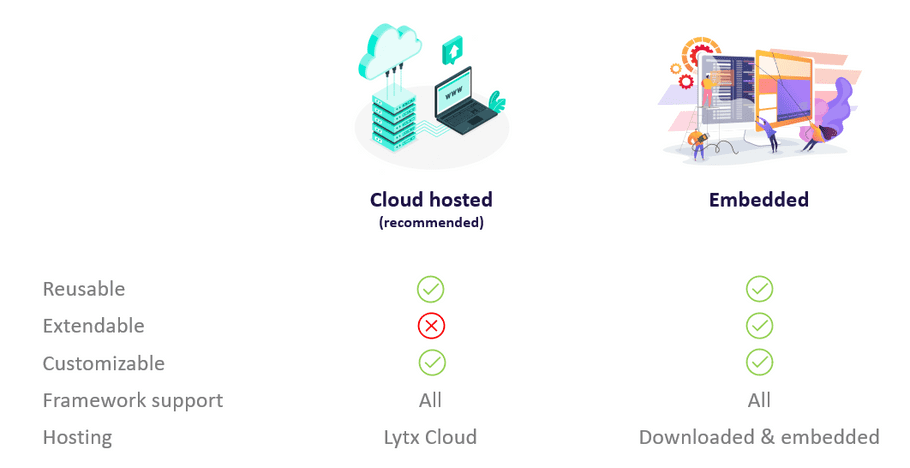
You can integrate Lytx reusable components into your project in one of two ways: either as a hosted component on the Lytx cloud (recommended), or as an embedded code. Both options make it easy to integrate into your platforms. You can apply the reusable components, configure, customize and extend them based on the requirements of your project.
The components can be installed by one of two methods:
Both methods:
- are responsive
- fully tested and QA’d
- include customizable parameters
- enable customzied styling (CSS)
The supported features and the differences between each are as outlined in the following image: